Sunday 6 November 2011
My attempt at a Vox Pop
this is my attempt at a Vox Pop, think i did it wrong, but here we go. The sound is also bad but at least i tried.
Saturday 5 November 2011
Annie Leibovitz Career Timeline
Career Timeline
I used this website to help me with my slideshare on Annie Leibovitz, it came in handy to see when she did things and what things came first. Then from this i googled individual photographs.


Thursday 3 November 2011
Summary of Annie Leibovitz and her work.
Over this term i have been studying Annie Leibovitz work and by doing this i have learnt lots of new things about how she works, her photography and photography in general in addition to ways in which i can present my photograph, last of all i have learnt new ideas for photographs and how to take them.
- Annie Leibovtiz is a portrait photographer that works with famous people to shoot most of her photograph, she started out very small and hit a jack pot when she started working for rolling stones, this was the best thing she could have done. From there on out she because huge by photographing famous people and has done for her entire career
- Her style is very different and original, she photographs famous people but in a fun playful way, she tends the dress them up as other people for example she dressed Alec Baldwin is dressed as the queen from snow white. All of her photographs are very cluttered, heavy and very much CGI'ed. None of the photographs are natural, they are all set up, most of them in a studio.
Wednesday 2 November 2011
help with shutter speed

- exposure time of 0.8 Seconds.
- 1/4000 s: The fastest speed available in most SLR cameras. Used to take sharp photographs of fast subjects, such as athletes or vehicles, under good lighting conditions and with an ISO setting of up to 800.
- 1/2000 s and 1/1000 s: Used to take sharp photographs of moderately fast subjects under normal lighting conditions.
- 1/500 s and 1/250 s: Used to take sharp photographs of people in motion in everyday situations. 1/250 s is the fastest speed useful for panning; it also allows for a smaller aperture (up to f/11) in motion shots, and hence for a greater depth of field.
- 1/125 s: This speed, and slower ones, are no longer useful for freezing motion. 1/125 s is used to obtain greater depth of field and overall sharpness in landscape photography, and is also often used for panning shots.
- 1/60 s: Used for panning shots, for images taken under dim lighting conditions, and for available light portraits.
- 1/30 s: Used for panning subjects moving slower than 30 miles per hour and for available-light photography. Images taken at this and slower speeds normally require a tripod or other camera support to be sharp.
- 1/15 s and 1/8 s: This and slower speeds are useful for photographs other than panning shots where motion blur is employed for deliberate effect, or for taking sharp photographs of immobile subjects under bad lighting conditions with a tripod-supported camera.
- 1/4 s, 1/2 s and 1 s: Also mainly used for motion blur effects and/or low-light photography, but only practical with a tripod-supported camera.
- B (bulb) (1 minute to several hours): Used with a mechanically fixed camera in astrophotography and for certain special effects.
Own work inspired by Anne Leibovitz

This is the third photograph i took inspired by Annie Leibovitz, i edited this photograph so that the background has not been affected when the photograph was edited but i changed the contrast again on holly, the model. I like the way she stands out over the whole background. I felt the background it slightly cluttered and the attention needed to be on the model not the background. so when i edited it i thought if i made the model stand out the attention would be drawn away from the background and more on the model. I did this by selecting the model and only changing things on her such as the levels.
Own work inspired by Anne Leibovitz

This is my second photograph inspired but Annie Leibovitz
This photograph was set up i asked her to stand how she was, not like the last photograph where i just took it and i liked how it looked. This one had been edited, upped contrast and little bit up on exposure, i think this makes it more like her photographs
Own work inspired by Anne Leibovitz

This is the first Annie Leibovitz inspired photograph. I took this photograph on Monday, Halloween. My friend holly dressed up and i used this as a good opportunity to take photographs in Annie Leibovitz style. This photograph was not set up but instead she was walking and i thought it looked nice, so i took the picture. And i like how she walked as i took the picture so there is movement lines around her legs. i like how they are so strong, i made these stronger when i upped the contrast and exposure. I did this to make it a stronger colour not knowing that i would have this effect, but i really like it.
Tuesday 1 November 2011
Tuesday 11 October 2011
this is another slide i found on the home page and really liked.
i found this slide show on the home page and i really like what the slide is trying to say and how it says it, simple images showing a lot of meaning.
Monday 3 October 2011
Annie Leibovitz

this is a collage of work by the main artist i chose to study, Annie Leibovitz. when I look at her work I can see that Leibovitz has a theme to her work. Most of what she does the theme of the image is dark and shaded, with one main focal of the photography, this tends to be a person in clothes that stand out against the dark, for example the top right, personally i see the lady in the red dress. It stands out against all the darkness of the photography. This works to make the photography stand out more, more remember able, personally i think shes does this well, if i saw most of these photograph's on line i would be able to tell that they are hers, you can tell due either to the darkness of the photograph and the dark heavy colours sometimes framed by interesting ways the shadow forms good focal point, or you can tell that they are her work by the interesting way they are taken. If she doesn't use the darkness and shadow to draw your attention she uses playfulness, they are both completely different but this is how she works. For example if you look at the bottom left compared to the photograph above, the bottom one is lots more playful.
Saturday 1 October 2011
slide share, slideshow i like
i found this slide when i searched music on slideshare, i like it as it is about music and the music indrustry. music is a huge part of who i am and the way music changes and trends intrests me, this slide is to do with trends and the way music changes and the way consumer listens and purchases music. and how much to indrustries make.
Thursday 29 September 2011
focal point- annie leibovitz
focal point is basically just what you, as the viewer sees first. if you have a bad focal point the viewer often see other things first and maybe even struggle to see the main focus of the photograph.
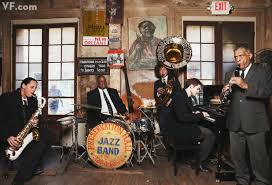 this is a example of bad focal point, Robert Pattinson is the main focus of the image, well should be, i personally struggle to see him. i now know where he is but when i first looked at the photography the first thing i noticed was the jazz band and the big instruments. looking more at it i can see that Robert Pattinson has be washed out.

this is good for focal point, there is not much in the photograph. only the two men, the do not follow rules of thirds but the way there is nothing else in the photo and that it is empty means you see them first.
FACTUAL: this is photo by Annie Leibovitz, an American photographer. The photos are of Mikhail Baryshnikov and Rob Besserer.
CONTEXT: this is a black and white photography, of two dancers on the Cumberland Islands in 1990
TECHNICAL: i think due to the time and the type of image, it will have been taken on a film camera with black and white film.
AESTHETIC: I really like this photography due to the colours, i like black and white photograph's anyway but i particularly like this one, because the image is so strong and the placement of the people are not following the rules of thirds so it makes it lots more interesting.
http://www.digital-photography-school.com/using-focal-points-in-photography can help if i got stuck
Tuesday 27 September 2011
composition- John Hedgecoe
composition is about what you do and don't have in the photograph and where things are placed and arranged in the photo.

FACTUAL: this is a photograph by john hedgecoe, a British photographer. He has made over 30 books on photography.
CONTEXT: it is a photograph of Henry Moore. Its a black and white photograph, like most of his work.
TECHNICAL: I think this will have been maybe taken on a film camera obviously with black and white film in. He has then developed it. i think it will not have been a digital photograph just in black and white because it has a old look to it that black and white digital can't get, and the lighting also has a strong contrast you normally get with film.
AESTHETIC: i like this photograph because of the old look of it, and the strong contrast in black and white. looking at this i want to take more photographs in black and white. and i like the composition of his head looking through his hands.
http://www.guidetofilmphotography.com/film-camera-composition.html <-- when i got stuck on composition this helped me
Saturday 24 September 2011
lighting- Annie Leibovitz
lighting can make or break a photograph, it plays a massive part in making the photo look good, for example if the light is totally wrong the model in the photograph can look horrible and reflect off of all the wrong places. but on the other hand it can also make a photography look amazing, reflect of jaw bone for example giving them amazing jaw line. this is happening in the photograph below as well, the light is hitting her jaw bone, amazingly

i think this is a good example of lighting, the was the light hits her and bounces of off her dress at the bottom, on the bottom left of the dress it disappears it is in so much light.
FACTUAL: this is by Annie Leibovitz photograph of Nichole kidman.
CONTEXT: this is a photograph of Nichole kidman, not for a fashion shoot. Annie takes photographs of beautiful famous people.
TECHNICAL: i think this photograph was taken in either a dance hall, or maybe a theatre, looking at the surroundings, lots of lights, i think it is more likely to be a theatre and the nature of the photography and the style, posh sophisticated, i would say theatre. the amount of lights play a big part and the shine and glisten on the dress, automatically draws you attention to Nichole Kidman and the dress she wears
AESTHETIC: i think this is a good example of lighting, the was the light hits her and bounces of off her dress at the bottom, on the bottom left of the dress it disappears it is in so much light. i think without the light this photograph would not be no where near as great.
This helps me with lighting http://photography.about.com/od/takingpictures/tp/photographylighting.htm
This helps me with lighting http://photography.about.com/od/takingpictures/tp/photographylighting.htm
Friday 23 September 2011
depth of field- vee speers
depth of field is the amount of distance between the closest and furthest,away objects in the photography. if you focus on an object, be it close to the lens, far from the lens, as the objects become further away from focal point start to become blurred and less focused, drawing attention the the focal point more.

FACTUAL: this is a photograph from the Australian photographer, now living is Paris, one of the many photos in the 'immortal' series
CONTEXT: The photographs in the 'immortal' are to represent the time stopping and preserving time and moments in a persons life
TECHNICAL: I don't know whether these photographs are actually taken in the area of the background or whether it is just a backdrop. Looking at the person in the photograph makes it look like she is not in the area, but i think it might just be the light and the making up on the person, i think it is meant to look like that though.
AESTHETIC: I like this photograph due to the way the colour in the model and the background are so different, and also the model looks so natural, no flash make up or anything, kind of 'at one with the background' in some sense.
http://www.cambridgeincolour.com/tutorials/depth-of-field.htm if i was stuck on anything i used this website to help
Wednesday 21 September 2011
first analysis- Vee Speers

FACTUAL: This is a photograph from Australia photographer, Vee Speers, birthday party series.
CONTEXT: Vee Speers came up with the idea of the series, after watching her own children and friends at their birthday party, fancy dressed. These photographs are to reveal the cruelty, vulnerability of children's lives in now generations. she captures children happy to play with imperfections and disregards.
TECHNICAL: i think these photographs are taken in maybe Vee Speers home, against a white wall, the colours are dull and washed out, her skin is pale but her he hair and dress stand out against white skin and wall. i believe that this photograph will have been taken with a slow aperture to let more light in.
AESTHETIC: i like this photograph due to the washed out, bleached and over exposed effect of the photograph and how it is simple, no flash effects or editing, its just a plain profile shot of a young girl.
Subscribe to:
Posts (Atom)